Branding Overhaul • Logo Design
Tecoustics
Vibration Control
As Art Driector:
I led the creative direction of the rebrand — overseeing research,
visual strategy, and execution of all design elements.

Rough Sketches
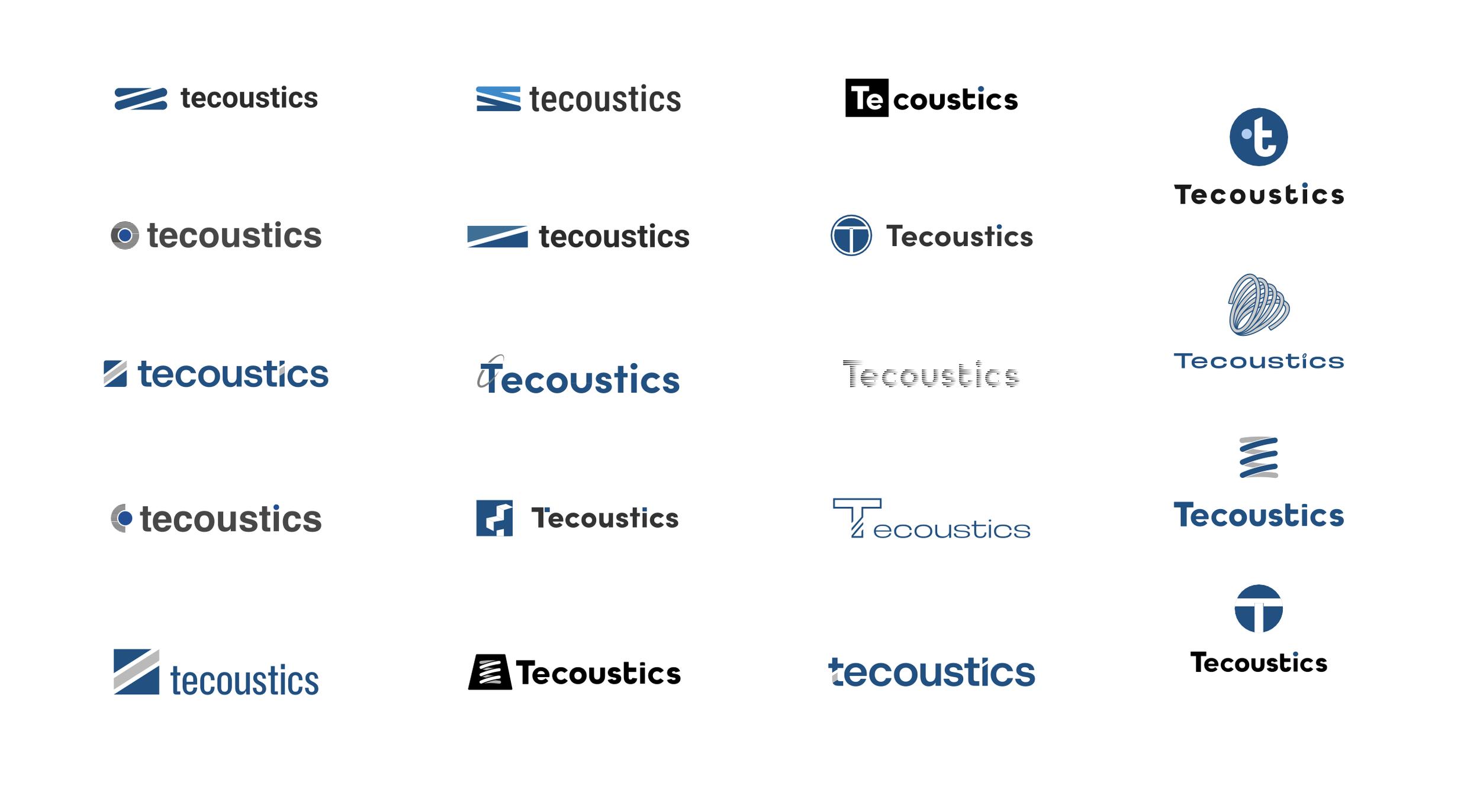
Problem
Although Tecoustics had been around for 15–20 years, their branding felt dated — with a logo and visual identity that looked stuck in the 1980s. It didn’t reflect their innovation or stand in a competitive market.
Need
To support sales and boost visibility, Tecoustics needed a modern, professional brand that would convey precision and trust.
Solution
We developed a new brand strategy rooted in innovation and reliability, then executed it with a clean, modern logo, an acoustic waveform–inspired color palette, updated typography, and revamped marketing materials — including their website and field signage. The rebrand elevated their professional image and helped drive new business.
Agency: Octopus Ink
Creative Direction:  Ron Angellotti
Art Direction: Ruizhou Li